Customizing your Help Center in Web2Chat allows you to create a branded and user-friendly support portal that aligns with your company’s identity. You can personalize various aspects of the Help Center, including its general settings, styling options, and homepage sections, to provide a seamless experience for your users.
How to Customize Your Help Center in Web2Chat
To customize your Help Center:
- Navigate to Knowledge Base--> Help Center from your dashboard in Web2Chat.
- Here you will find the following options: General, Styling, Homepage sections.
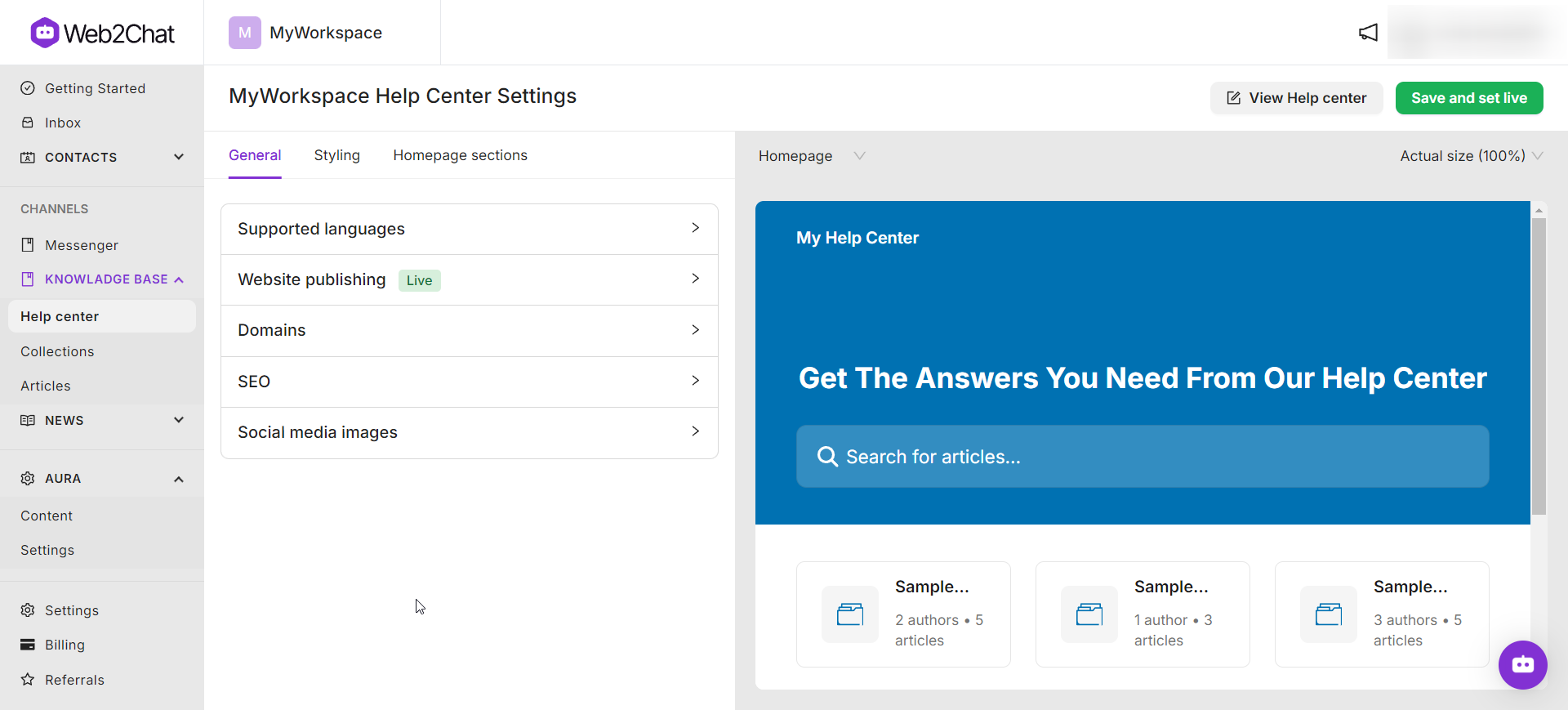
General
The General settings allow you to manage essential Help Center configurations, including language support, website publishing, domain settings, SEO, and social media images.
Supported Languages
Enable multilingual support to cater to a global audience.
- Default Language: Set the primary language for your Help Center by clicking on the 'Default language' option and choosing the primary language from the dropdown list of options.
- Additional Languages: Add multiple languages for users to access localized content by clicking on the +Add Language button.
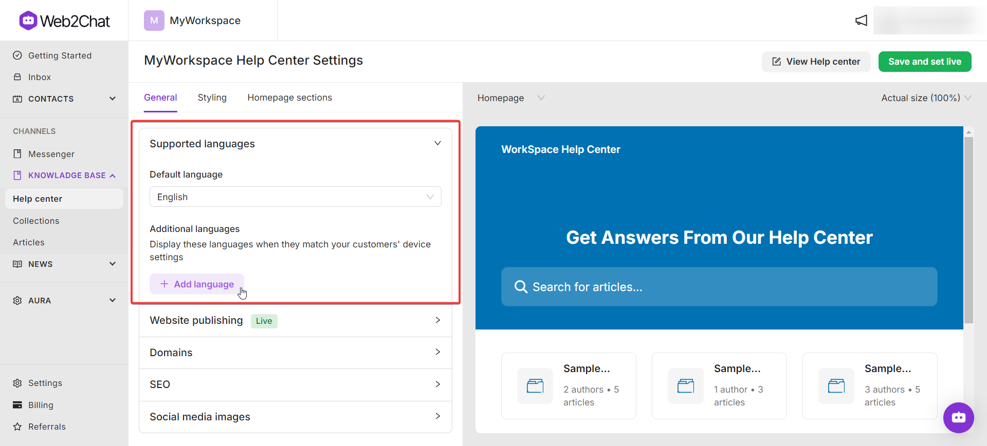
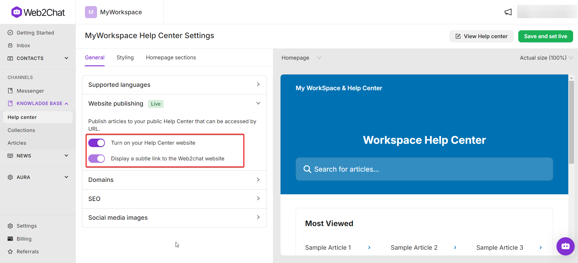
Website Publishing
Toggle the option to Turn on your Help Center website to publish your articles and make them accessible to users.
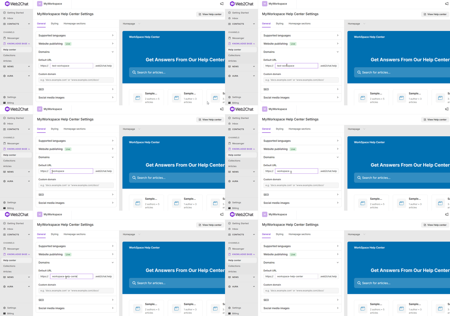
Domains
Configure the URL for your Help Center:
- Default Domain: Use the standard Web2Chat URL for your Help Center.
- Custom Domain: If you've purchased the custom domain add-on, update the Help Center’s domain to reflect your brand.
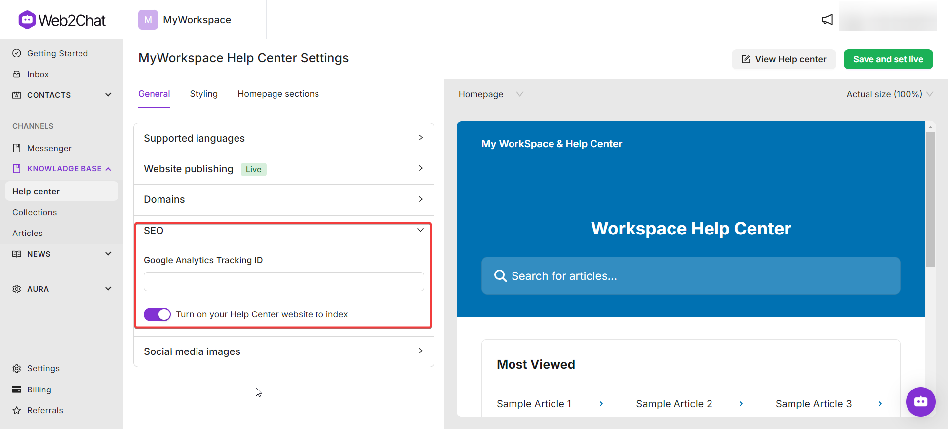
SEO
Improve visibility with search engine optimization settings:
- Enable Indexing: Allow search engines to index your Help Center content.
- Google Analytics Tracking ID: Add a tracking ID to monitor site performance.
Social Media Images
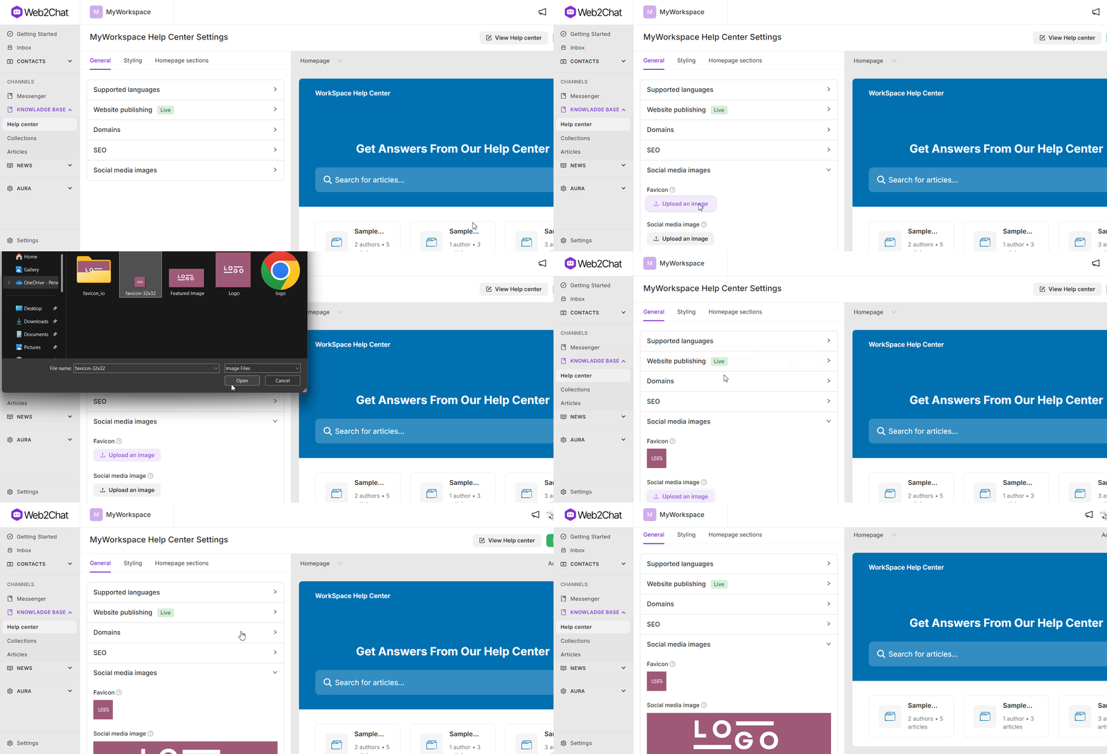
Ensure your Help Center is visually appealing when shared on social media:
- Favicon: Upload a favicon to be displayed in the browser tab.
- Social Media Image: Add an image to represent your Help Center when shared on social media platforms.
Styling
The Styling section allows you to customize the appearance of your Help Center, including shared elements, header, hero block, footer, and collections page.
Shared Elements
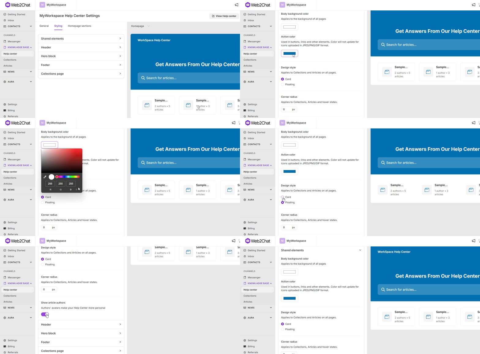
Update the overall style and appearance across all Help Center pages:
- Background Color: Set the background color for all pages.
- Action Colors: Choose colors for buttons and other action elements.
- Design Style: Select between Card or Floating styles for displaying collections and articles.
- Corner Radius: Adjust the border radius of various elements.
- Author Details: Toggle the display of the author’s name and avatar for articles.
Header
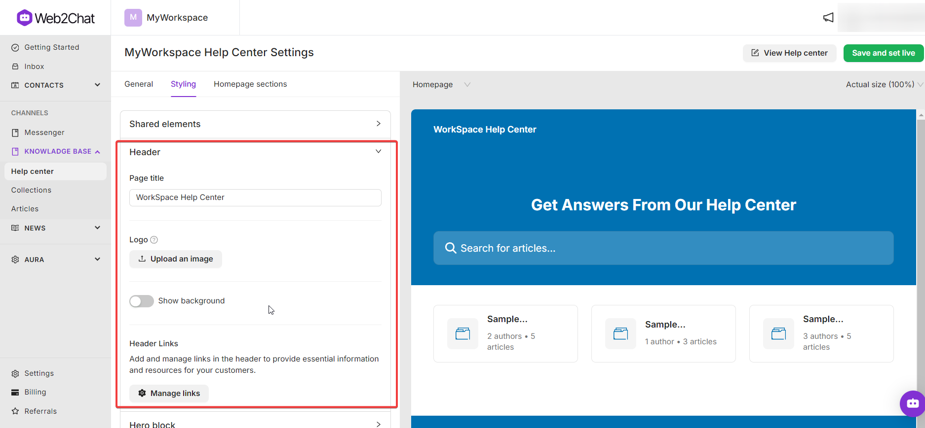
Customize the header to create a consistent navigation experience:
- Page Title: Add a title for the Help Center. If multiple languages are enabled, provide different titles for each language.
- Header Logo: Upload a logo to display in the header, and choose to show it in the background.
- Linking: Set links for the header to direct users to relevant pages.
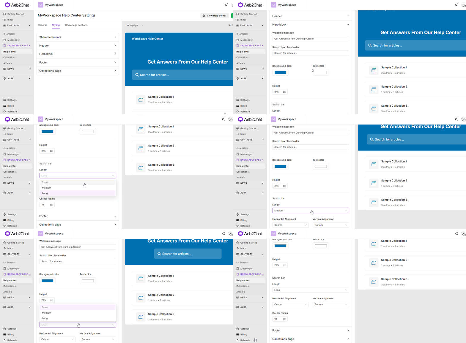
Hero Block
Personalize the main area at the top of your Help Center:
- Welcome Message: Add a greeting or introductory text, with support for multiple languages.
- Search Box: Customize the placeholder text and adjust the search bar's length, alignment, background, text color, and height.
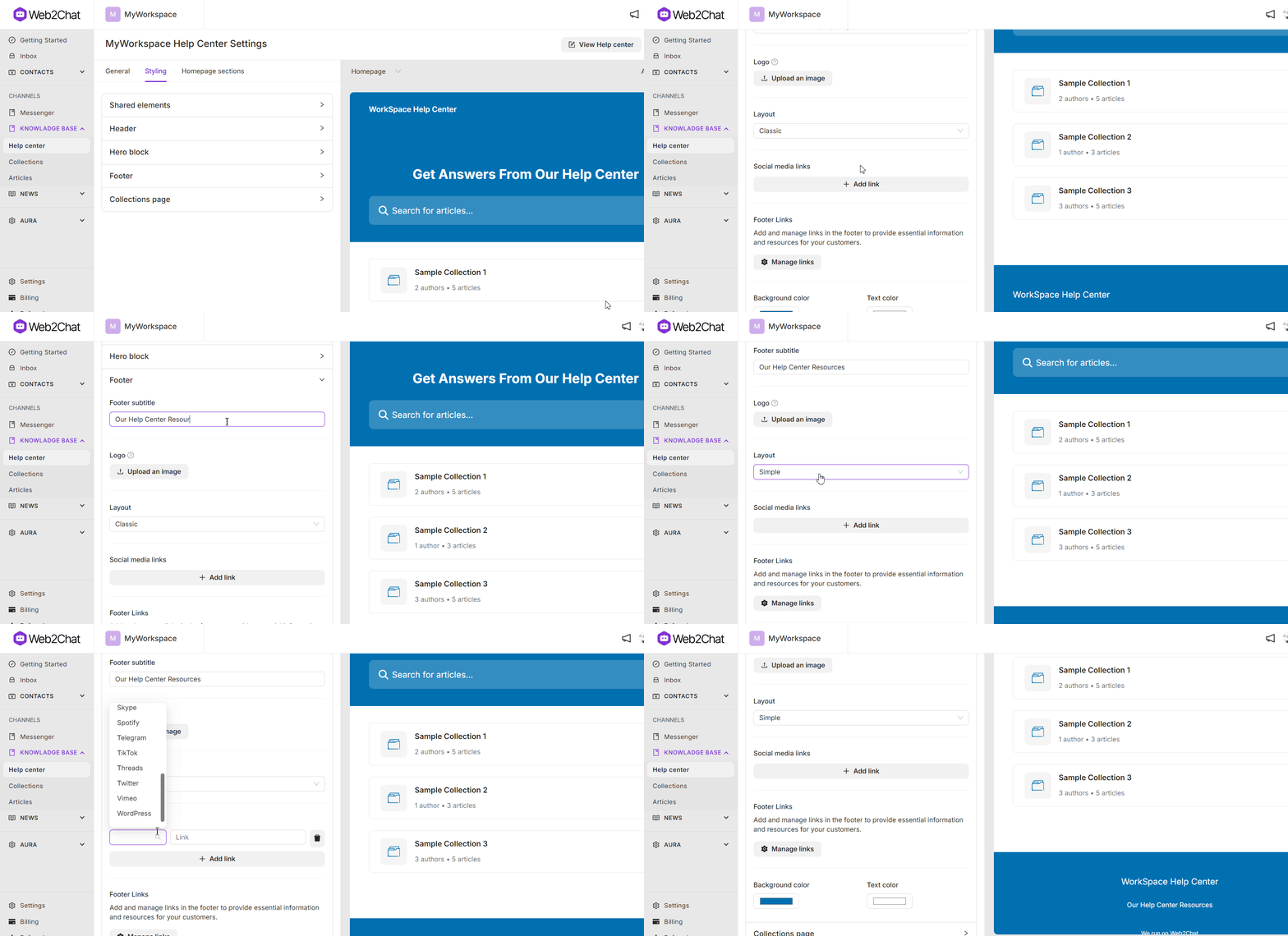
Footer
Tailor the footer to provide additional resources and branding:
- Footer Layout: Choose between Simple and Classic layouts.
- Logos and Links: Add a logo, social media links, and custom links to other resources.
- Colors: Set the background and text colors for the footer.
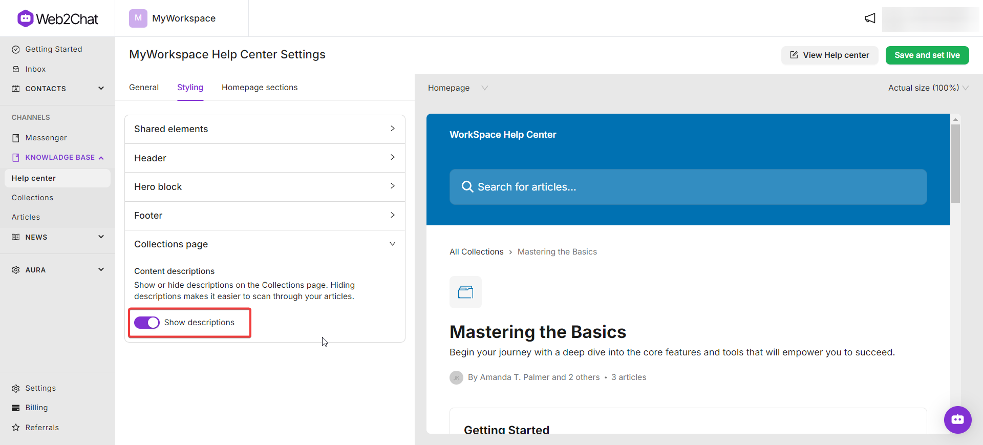
Collections Page
Manage how content is displayed on the collections page:
- Content Descriptions: Toggle to Show or Hide descriptions on the collections page to help users scan articles more efficiently.
Homepage Sections
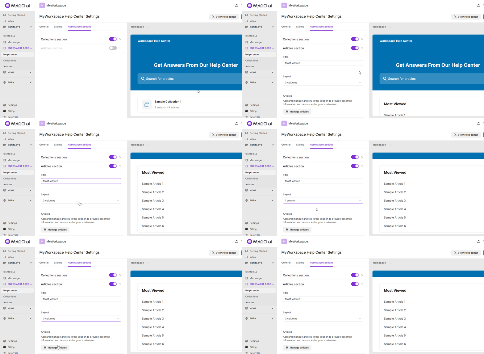
The Homepage Sections settings allow you to customize how different sections are displayed on your Help Center homepage.
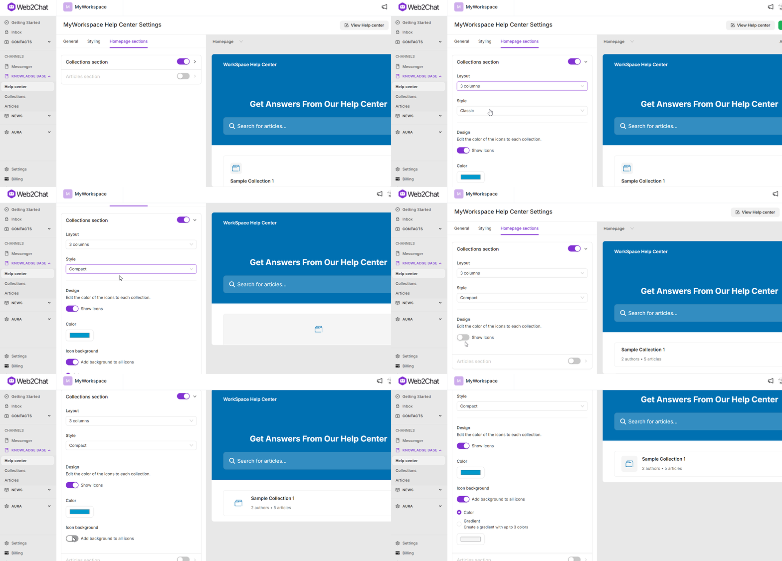
Collections Section
Display Help Center collections prominently:
- Section Style: Choose between Classic, Visual, and Compact styles for showcasing collections.
- Columns: Display up to 3 columns of collections.
- Icons: Choose to show or hide icons, adjust their colors, and add background colors.
Articles Section
Present individual articles in a distinct section:
- Columns: Configure up to 3 columns for displaying articles.
- Article Management: Add, edit, and organize articles to ensure important content is easily accessible.
Customizing your Help Center in Web2Chat ensures a cohesive and branded user experience, from appearance settings to content organization. Leverage these customization options to enhance your support portal and meet your users’ needs.
If you need more assistance, feel free to contact our Customer Support.
